Pimp your PowerPoint
Start designing attention-grabbing presentations that stand out from the typical snoozers.

In the middle of the 19th century blackboards were all the rage. According to Pennsylvania State University engineering communication professor Michael Alley, it was common for universities and research institutions to proudly advertise that they had the only slate writing board in a 100-mile radius. Scientific lectures became more engaging than they’d ever been.
More than 150 years later, there’s still room for improvement. “People are not anywhere close to tapping the potential that a PowerPoint presentation offers,” Alley says. “We have a tool that can do an incredible amount, and people just waste it.” Who hasn’t been lulled into a somnolent state by some well-intentioned scientist presenting his research to a captive audience by reading a seemingly endless stream of bullet points?
But it’s not too late for the scientific community to start using the software to greatly enhance knowledge transfer, says documentarian Ron Galloway, who recently produced and directed, Rethinking PowerPoint, a film on building better presentations. “The old ugly hateful PowerPoint slides are sort of going by the wayside,” he says.
Communications experts and cognitive scientists agree that there are wrong ways and right ways to use presentation software like PowerPoint, or its Apple-based cousin Keynote. “Explanation graphic designer” and long-time Time magazine infographic guru Nigel Holmes says that he approaches giving talks as an actor playing a part. “It’s much more theater than anything else as far as I’m concerned,” he says. “It’s not a lecture, it’s a performance.”
Here are some tips and tricks to help you craft a presentation that will wow your next audience and may just influence those around you to make their own PowerPoint talks more theatrical and less brain numbing.
As with effective writing, keeping the audience, their expectations, and limitations in mind is key to making engaging PowerPoint presentations. Harvard University cognitive neuroscientist Stephen Kosslyn has studied hundreds of digital slideshow presentations, tracking their impact on volunteer audiences. “In general, humans have a measurable set of limitations and you have to respect those,” he says. These three cognitive principles were most commonly violated by presenters.
Go for the BIG difference
The human brain is better at perceiving large differences rather than more subtle ones. Violations of this principle typically crop up as differences in font size or color that are too slight for audience members to quickly notice. Avoid using cobalt blue, as a font or border color, as the human brain has difficulty bringing that color—which is a combination of red and blue—into focus. Likewise, using red and blue on the same slide can be distracting.
The brain likes it just right
Kosslyn calls the principle that audience members have limited capacities for the retention of information the “Goldilocks Rule.” Communication is most effective when neither too little nor too much information is presented at any one time, he says. Audience members can only typically handle four “perceptual units” (a word, phrase, or picture) at a time says Kossyln. For example, an assertion sentence (1 unit) followed by two images and one phrase (four units total) is easier for an audience to grasp and retain than a slide filled with bullet points.
Signpost changes in information
Audiences key in on perceptual differences, so when introducing a conceptual jump, signal the move with a significant shift in the accompanying imagery. Things like images appearing or arrows directing the audience’s attention to a specific part of a curve can greater emphasize the transition to a new idea. But don’t overdo it. If a visual jump, such as changing background color or font size, is made without a corresponding shift in the information, you risk confusing your audience, Kosslyn notes.
Methods Slide

Results Slide
Unplug, think, and write
According to Galloway, using PowerPoint to make a great presentation starts with powering down the laptops and writing out an outline on index cards or a legal pad. “People have to shut off their computer and go away as they’re writing their PowerPoint presentation,” he says.
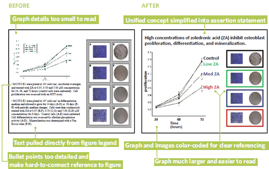
Establish your assertion
Alley says that he starts planning each slide by writing down a single sentence stating the idea he wants the audience to take away. “You have defined what it is you need to support that statement,” he says. “That’s where it starts.” Alley adds that the sentence should only take one or two lines, should consist of only 8–14 words, and should appear in 28-point font when inserted in the final PowerPoint presentation.
Assemble the visual evidence
Let the assertion sentence for each slide guide your decision as to which visuals should accompany it. Use “explanatory images”—not decorative or descriptive images—to support each assertion, says Joanna Garner, assistant professor of psychology at Pennsylvania State University. When describing the context or methods of your research, photos and movies are ideal pieces of evidence; when presenting your results, elements like graphs, tables, or charts (appropriately highlighted to emphasize key points) will do the trick.
Challenge the defaults
When you actually open up PowerPoint, forget about the program’s suggested defaults. Start with a blank slide, say Alley and Galloway. That way, you can insert your assertion sentence at the top of the slide and pull in appropriate images free from the constraints of the program’s preset inclination towards bullet points and subheadings.
The next generation of presentation software packages is here, making it easy to get input on your slides from your collaborators without sending huge files. RocketSlide, ClearSlide, Google Documents, and Prezi, are just a few of the new online tools that let you design, work on, store, and access your presentation online. Most provide the capability for multiple users to view a presentation at the same time in a Web-conference setting and offer a free trial with options to pay relatively reasonable monthly fees for continued use.
• The Craft of Scientific Presentations: Critical Steps to Succeed and Critical Errors to Avoid, by Michael Alley, Springer-Verlag, Berlin, 2003. $39.95.
• Presentation Zen Design: Simple Design Principles and Techniques to Enhance Your Presentations, by Garr Reynolds, New Riders Publishing, 2010. $31.49.
• slide:ology, by Nancy Duarte, O’Reilly Media, Sebastopol, Calif., 2008. $34.99.
• The Visual Display of Quantitative Information, by Edward Tufte, Graphics Press, Cheshire, Conn., 1983. $40.00.
Read more: Pimp your PowerPoint - The Scientist - Magazine of the Life Sciences http://www.the-scientist.com/2010/03/1/76/1/#ixzz0j14AVCHi
http://www.youtube.com/watch?v=d04w4vvByDI
Nenhum comentário:
Postar um comentário